The decoration concept of “light decoration and heavy decoration†is deeply rooted in people's minds. Nowadays, owners are more willing to spend more on soft clothes. As a result, indoor soft assembly color science has also emerged. Different people have different needs for color, especially for the elderly and children. Because of their special color perception and color psychological needs, how to take care of the needs of these two groups has become a difficult point to create a livable living environment. In this issue, we will talk about the color scheme of the children's room ( children's room decoration renderings ) and the elderly room - A complementary color children's space With the rapid development of the times, not only children of school age have experienced the diversified development of society, but even preschool children have come into contact with this colorful world. Among them, color is one of the ways for children to feel the world first. How to create a creative living space for children with the color of soft-packed home? The soft-pack designer believes that the room atmosphere of the children's room needs to be achieved through a strong contrasting color combination, so whether it is walls, floors , bedding or lighting, the color color is often higher. For example, if it is a girl's family, the hard-wearing part can choose a simple white wall, while the soft-packing can use yellow, blue, pink and other colors as the main color frame of the space. It is best to use bright complementary colors, such as yellow and blue, which can also form a strong contrast in brightness. The complementary color combination gives a deep impression. However, due to functional requirements, the bedroom ( bedroom decoration renderings ) space should not use large areas of high-color color, so we can use high-color color as an embellishment, through the complementary color contrast, strong contrast, and other means to create a sense of "vigor". Grasp the level of color and the texture comparison of furniture and textiles in detail . For example, in the above color matching, the bright yellow color can only appear in the desk ( desk decoration rendering ) chair, the sofa armrest, the desk drawer, the trunk, the shoe cabinet decoration, and the blue color is placed in the visual center portion of the space. At the same time, other decorative elements in the room can be yellow and blue, reducing the chroma, and distributing them in different patterns to form a rich color layer. B Care for the elderly life with color If you live with the elderly, then the family decoration should also fully consider the needs of the elderly, and rationally arrange the elderly room. After the age of 35, the eye crystals will gradually appear "yellow" phenomenon. With age, the elderly will be less sensitive to some colors, and the perception will gradually decline. For example, most middle-aged and older people gradually have a lower ability to distinguish gray scales, and the ability to distinguish weaker brightness is worse. Therefore, the color design of the elderly room needs to target the color visual characteristics of this group of people, and the color matching of the middle and high contrast is preferred. "Commonly speaking, in the elderly's room, furniture, walls, floors, cabinets, home textiles, etc. are all important household products. In order to facilitate the use of the elderly, the color contrast of these products is best clear. For example, the elderly room The combination of black and white and gray has successfully followed the principle of contrast between medium and high brightness. The important color elements such as bed, wall, bedside table, decorative painting and drawers are also black and white," said designer WISCO. The overall color of the elderly room can also choose warm colors, such as warm yellow tone space, which is more suitable for the color sensitive areas of the middle and old aged, such as white wall, dark floor, walnut table and chair, etc., but also through carpet, bedding, lampshade Improve the elements that are easy to adjust. Older people should avoid frequent use of reflective elements such as glass drawers, clocks, etc. Because high-reflective elements are concentrated in the bedroom space and are prone to visual fatigue, these elements are more suitable for younger middle-aged couples. C should not exceed three colors Home color matching has its own principles, otherwise the color matching failure will appear chaotic, disorderly, and unattractive. When people enter the room, most of the initial impression comes from the feeling of indoor color. Therefore, color is an important factor that can not be ignored in interior decoration design. The color of the room space is preferably no more than three, and the three neutral colors of white, gray and black are negligible. In the absence of designer guidance, the best color scheme for the home is - the color of the wall is the lightest, the color of the floor is darker than the wall, and the color of the furniture is the deepest, so that the match does not go wrong, and the home is very layered. . If the furniture and soft clothes are matched with different shades and shades of the same basic color, the interior can be quiet and harmonious. In general, the bedroom and study use this combination. For example, bedding, curtains, seats, etc. use the same color but a lighter shade, while small items such as shelves, frames, vases, etc. use the darkest shades of the same color. The contrasting color scheme adds visual appeal. The use of two colors, such as red, green and blue, complements each other, producing a strong contrast effect, making the room vibrant and vibrant. This color matching is used for family activities, audio-visual rooms, and the like. Neutral colors such as black, white, gray, and brown are popular colors in recent years, and the matching effect is also outstanding. These neutral colors feel soft and don't give you too much visual stimuli, perfect for creating elegant spaces. But this kind of color is also easy to cause a stiff, cold feeling, so you can soften the natural elements such as wood color on the jewelry, or use a contrasting warm color such as red to reduce the stiff effect. It is important to note that the ceiling color must be lighter than the wall or the same color as the wall. When the color of the wall is dark, the ceiling must be light, and the color of the ceiling can only be white or the same color as the wall, otherwise it will make people feel depressed and strange. Sofa Bed,Foldable Sofa Bed,Space Saving Sofa Bed,Living Room Foldable Sofa Kaifeng Lanwei Smart Home Co., Ltd , https://www.leather-recliner.com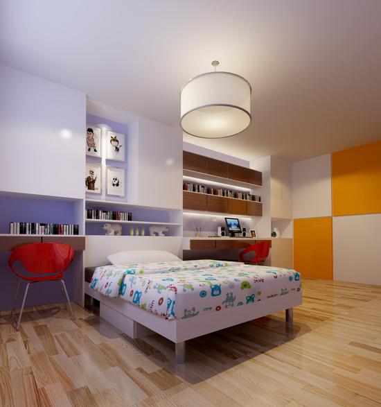
There is a big emphasis on the color matching of the elderly and children's rooms.