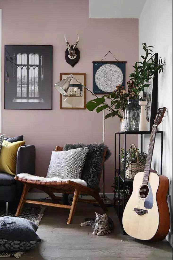
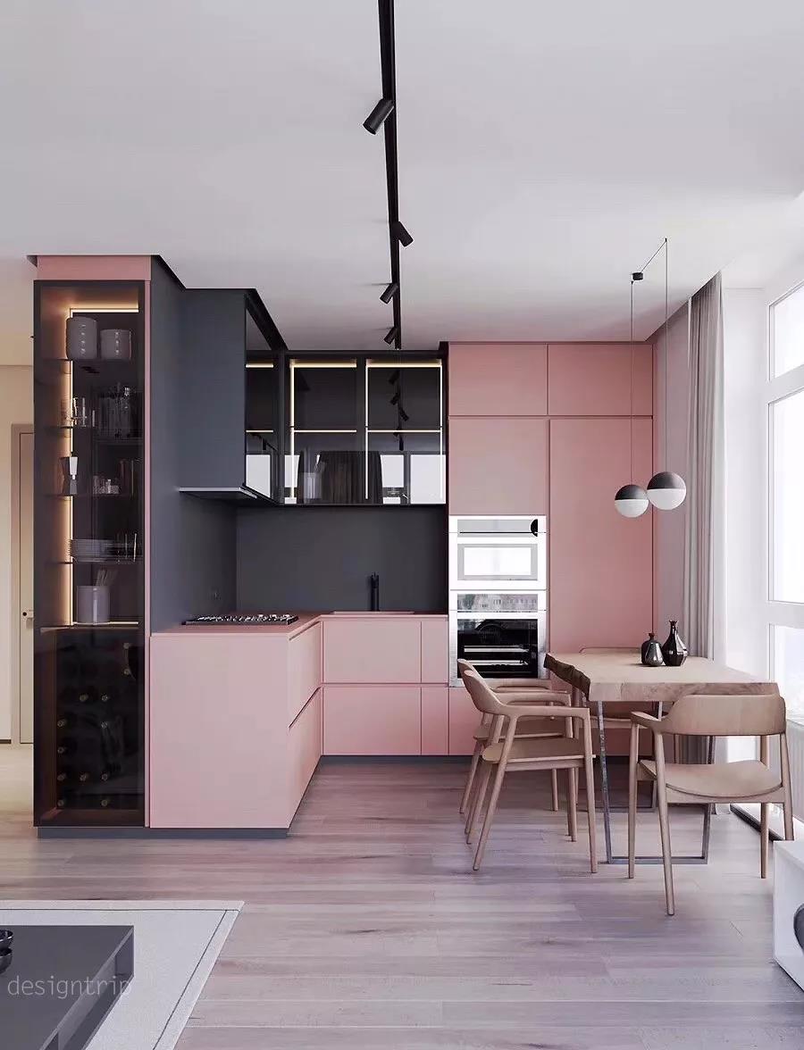
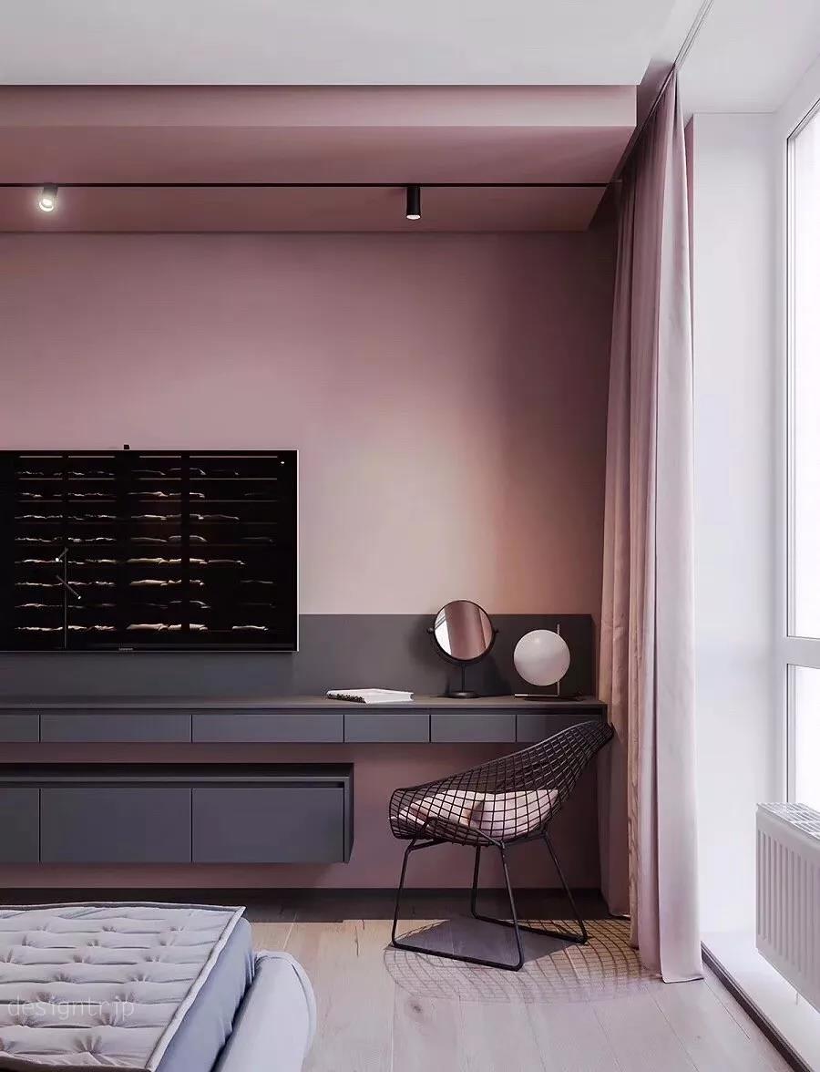
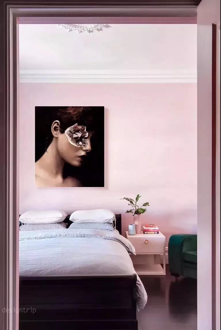
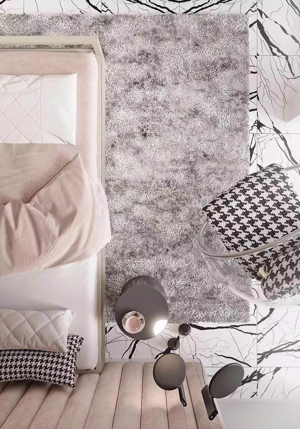
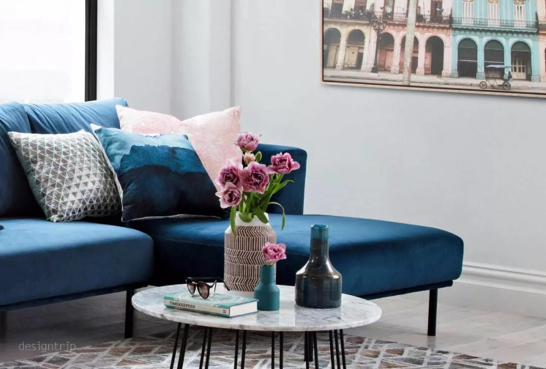
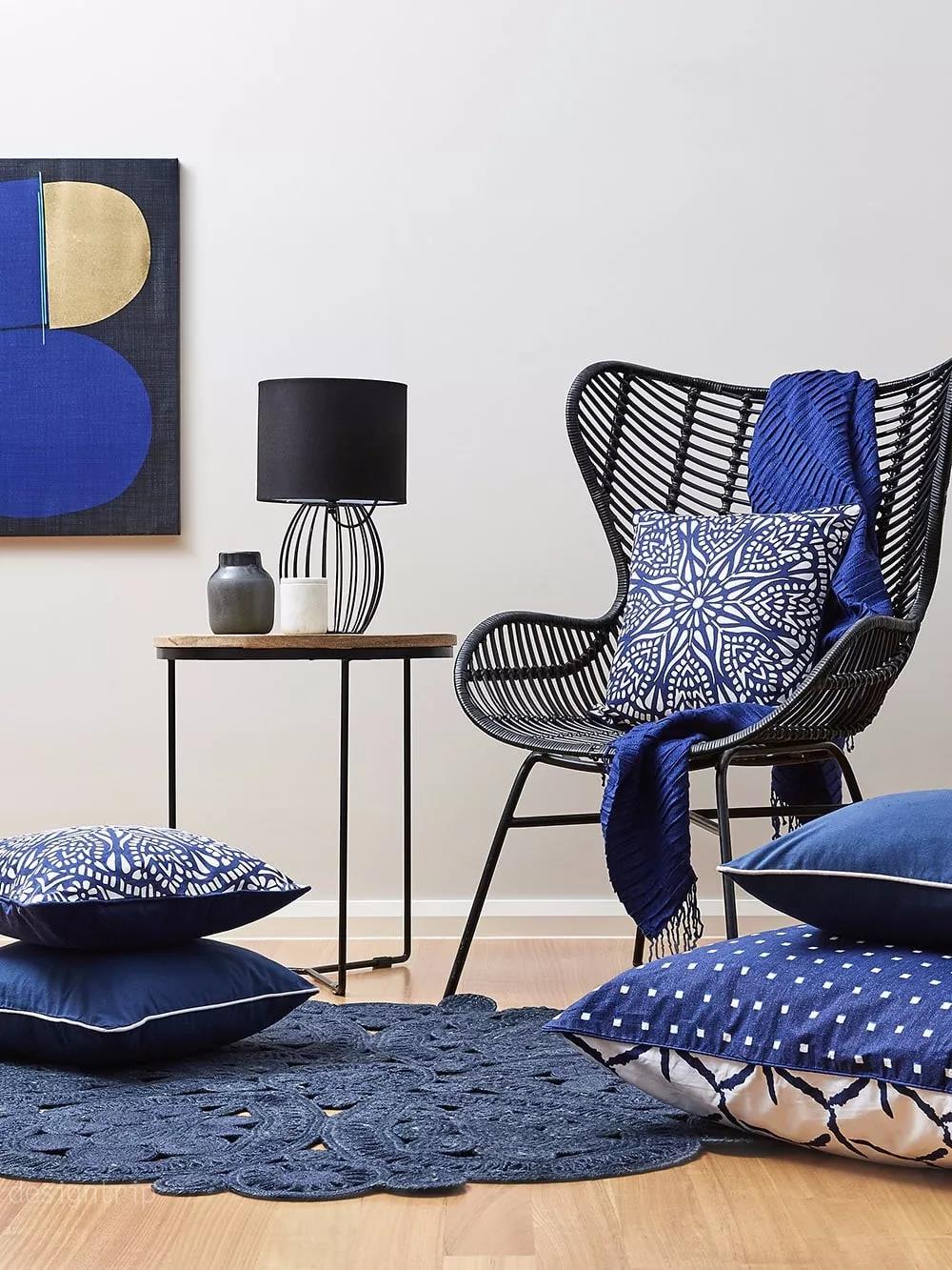
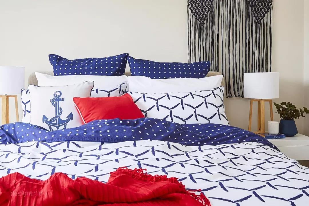
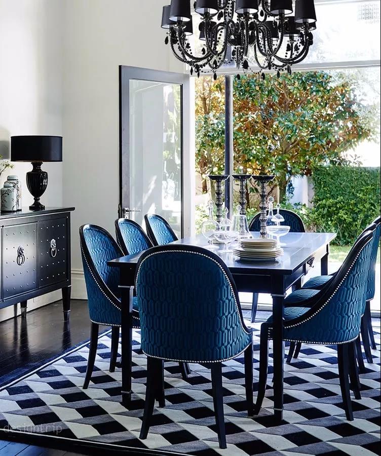
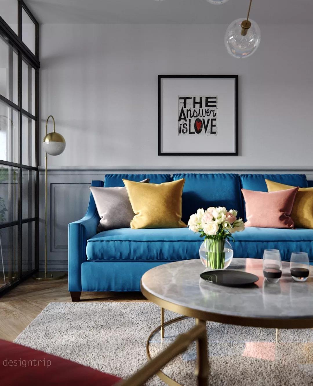
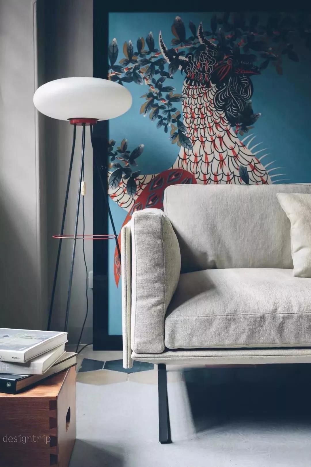
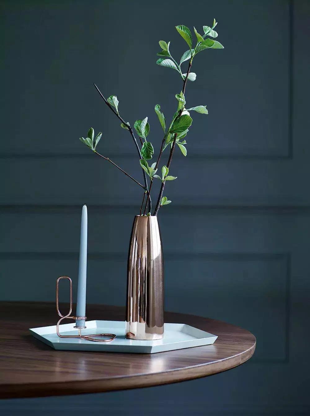
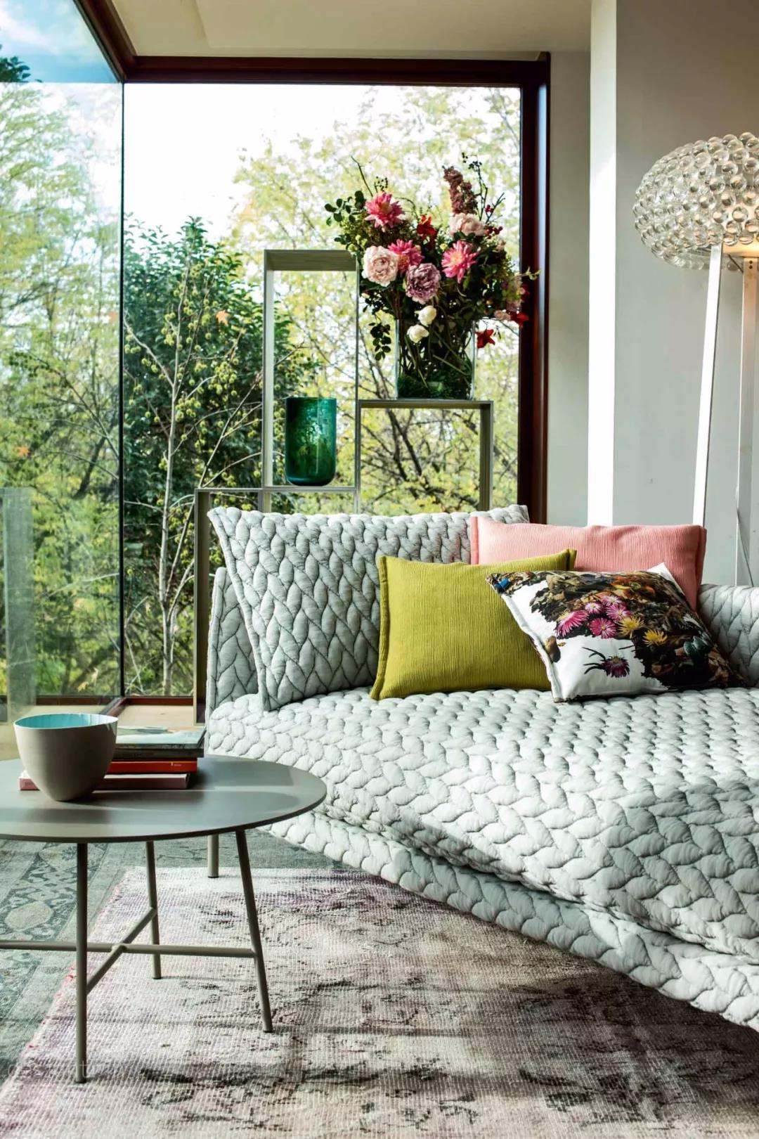
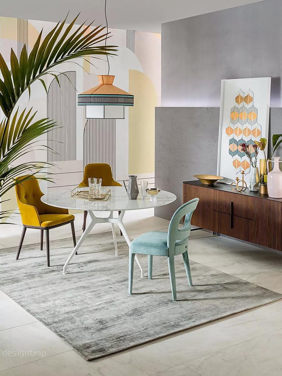
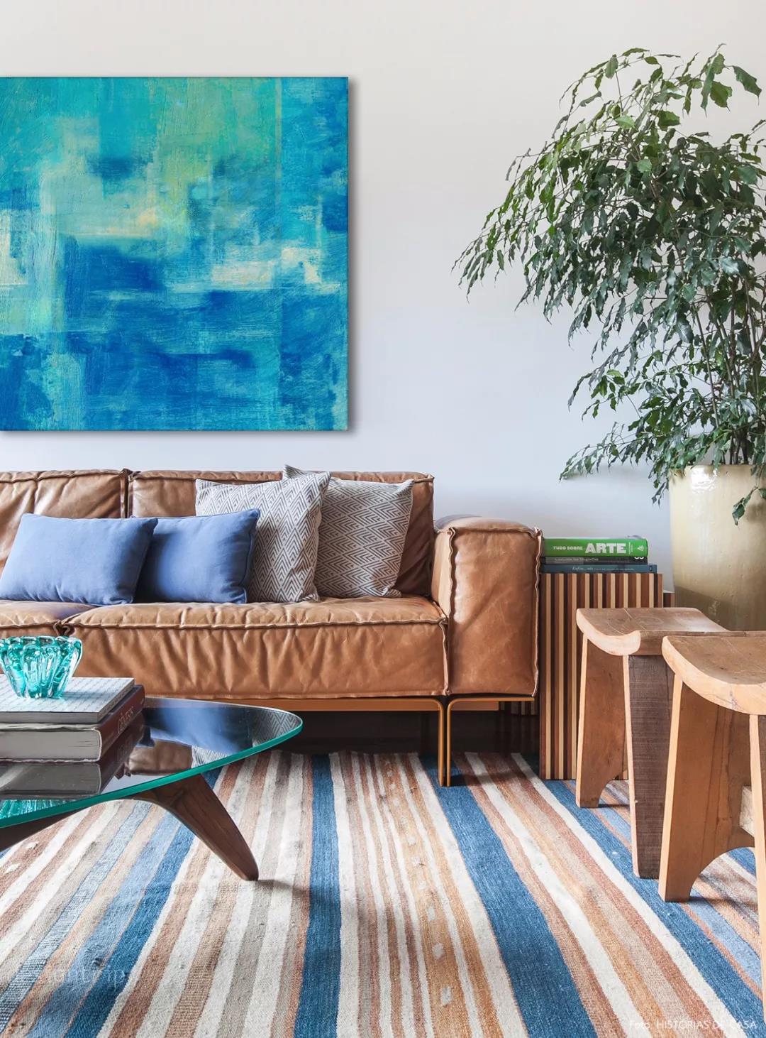
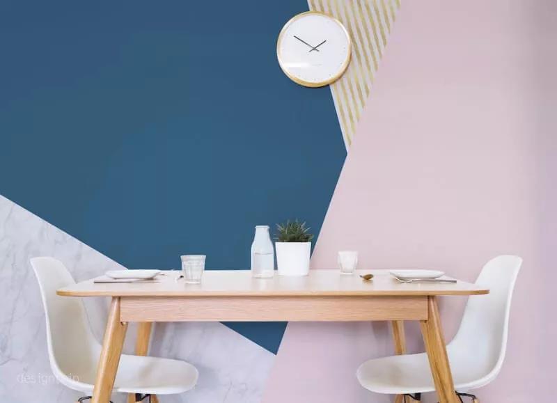
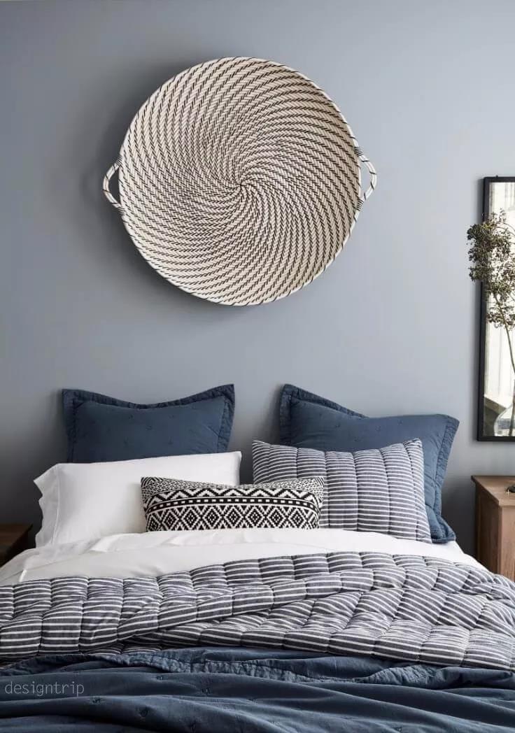
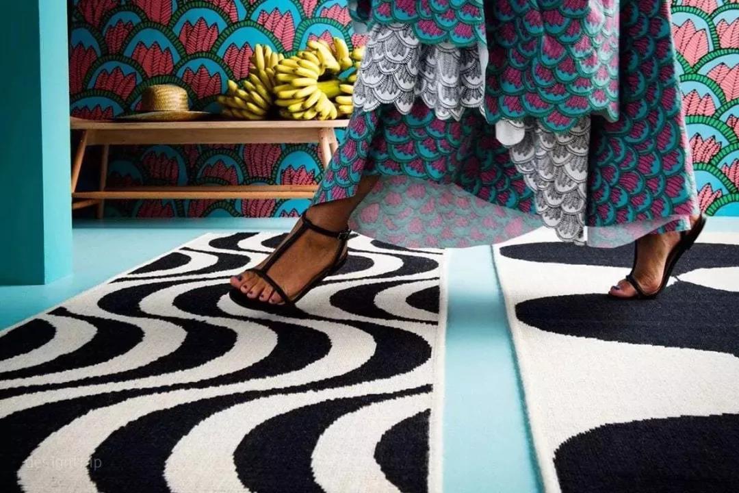
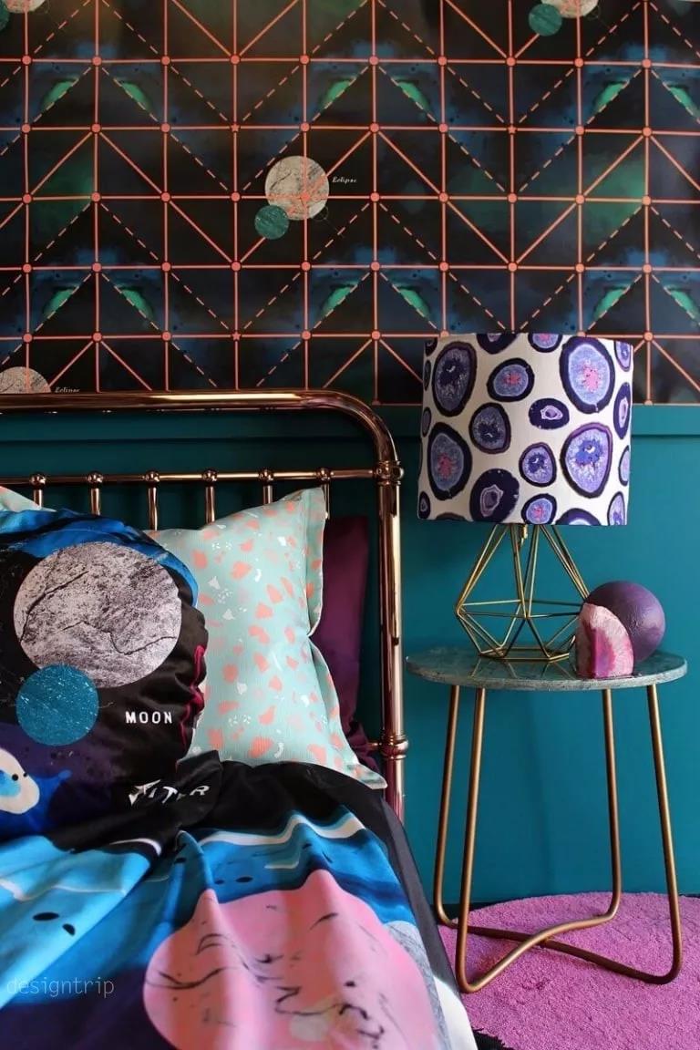
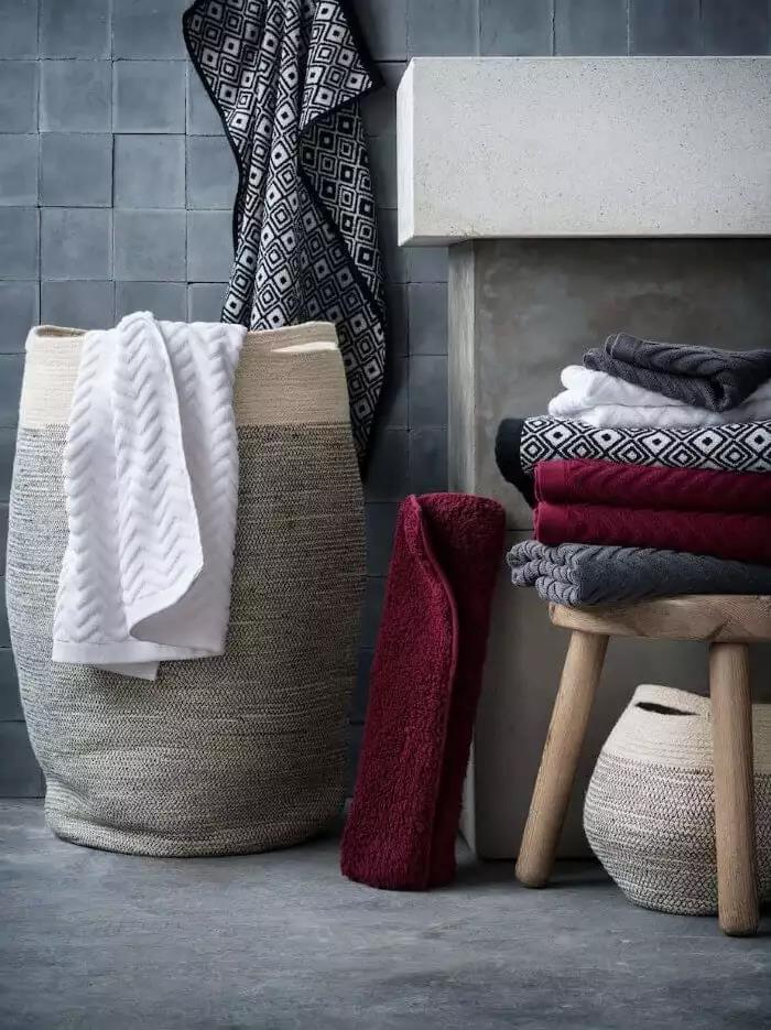
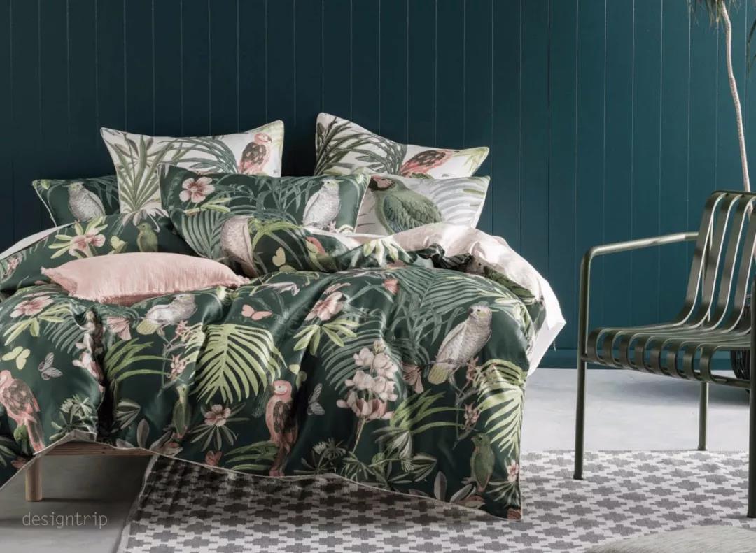
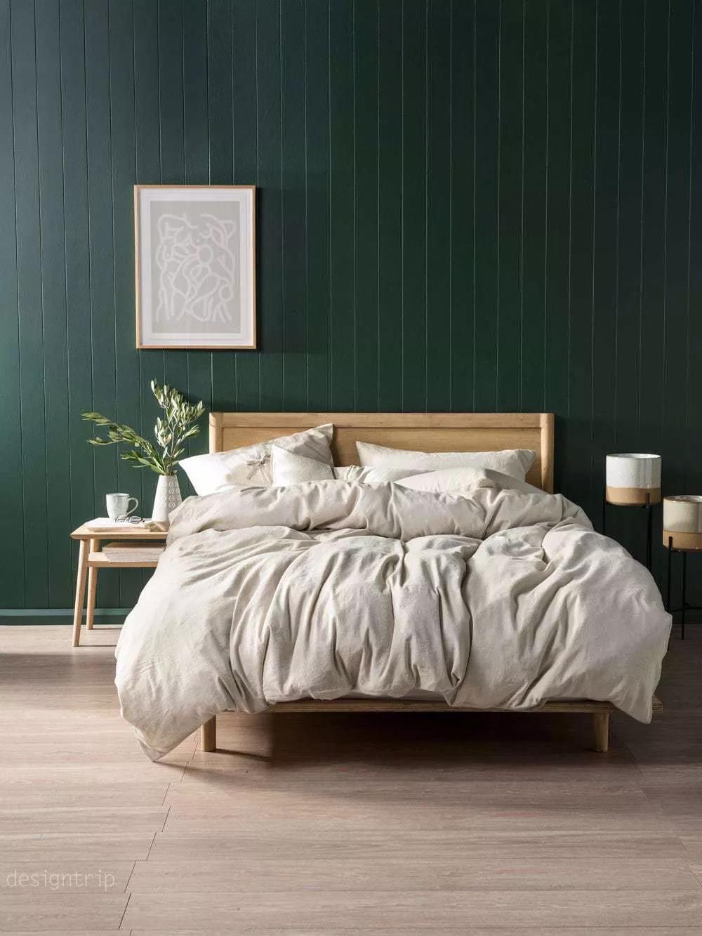
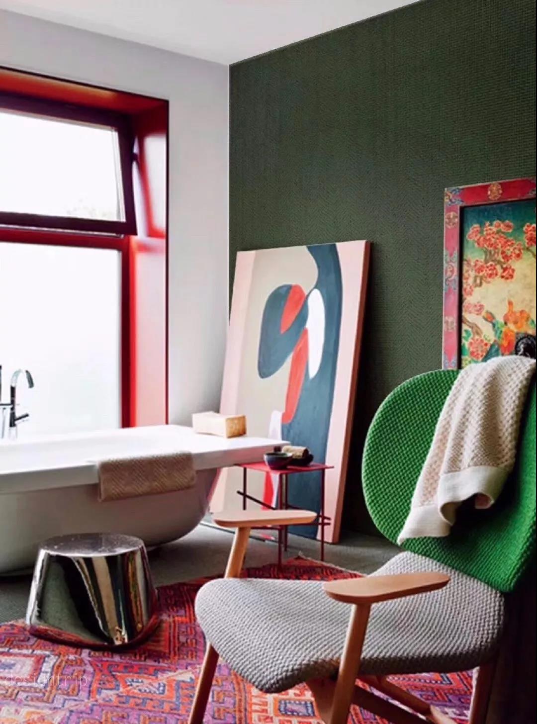
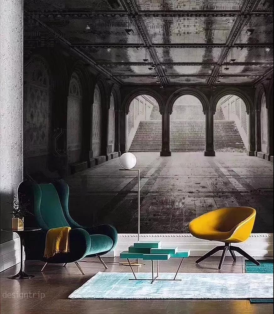
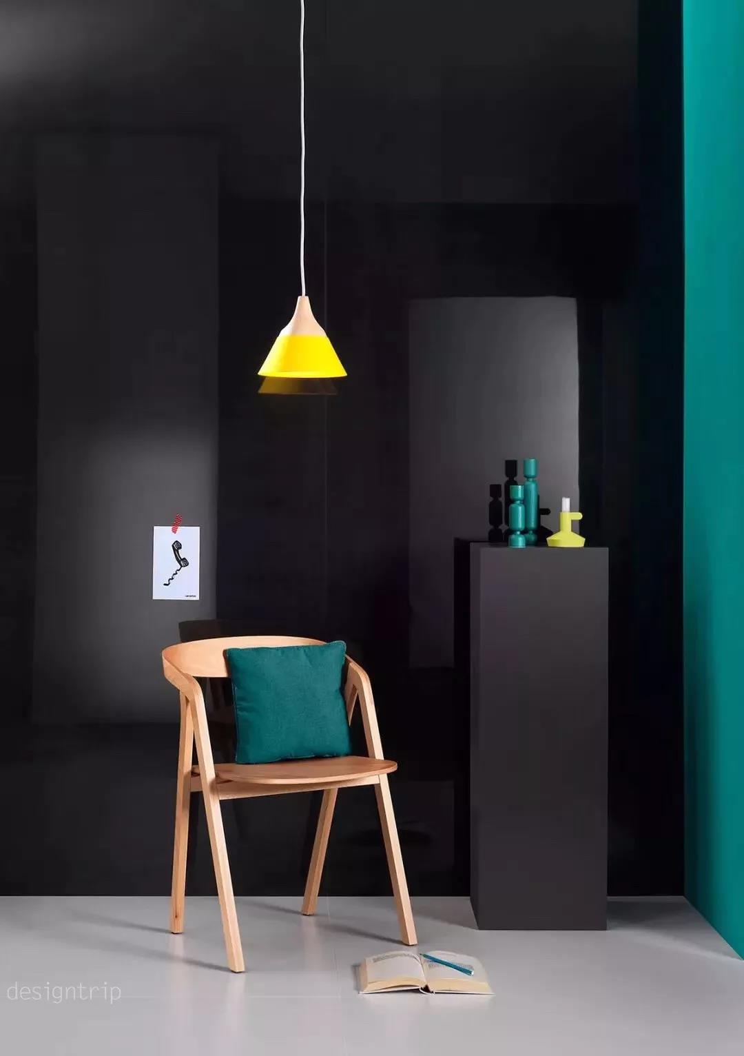
In the world of color Even if you don’t say it again The other party can also completely get to you. In the world of color Can achieve silence without sound You don't have to be "sorrowful and hateful" The psychological effect of color Each color has a special psychological effect, which can affect people's temperature perception, spatial perception and even emotion. The sense of warmth and color of color originates from people's association with certain things in nature. For example, warm colors such as red, orange, and yellow will remind people of the flames and the sun, and thus have a warm feeling; cool colors such as white, blue, and blue-green will associate with ice, snow, ocean and shade, and feel cool. Color-based chroma and brightness can also create different spatial senses, which can produce forward, backward, convex, and concave effects. The warm color with high brightness has the feeling of standing and moving forward, and the cool color with low brightness has the feeling of being recessed and far away. The role of the sense of space in the layout of the room is obvious. In a room with a small space, the color of the back can be used to make the wall look far away, giving the room a feeling of openness. The brightness and purity of color can also affect people's emotions. The bright warm colors give a lively feeling, and the dark colors give people a sense of melancholy. White and other solid colors make people feel lively, while black is melancholic. This psychological effect can be used effectively. For example, a living room with insufficient natural light, using bright colors, will make the living room enveloped in a beautiful atmosphere, which will make people happy. Form and color obey function Fully consider the functional requirements Indoor color should mainly meet the functional and spiritual requirements, in order to make people feel comfortable. In terms of functional requirements, we should first carefully analyze the nature of the use of each space, such as the children's room and living room, the elderly's living room and the newlywed's living room. Because of the different use of objects or the use of functions, the design of space color must be There is a difference. Designers must strive to conform to spatial composition. The indoor color configuration must conform to the principle of spatial composition, give full play to the beautification effect of indoor color on space, and correctly handle the relationship between coordination and contrast, unity and change, and subject and background. In interior color design, you must first set the main color of the space color. The main color of the color plays a leading role in the indoor atmosphere, retouching, foiling and setting off. There are many factors that form the main color of the interior color, mainly the brightness, chroma, purity and contrast of the indoor color, and secondly deal with the relationship between unity and change. There is no change and no change, and the effect of beauty is not achieved. Therefore, it is required to seek changes on a unified basis, so that it is easy to achieve good results. In order to achieve uniformity and change effect, large-area color blocks should not be used with excessively bright colors, and small-area color blocks can appropriately improve the brightness and purity of colors. In addition, the interior color design should reflect the sense of stability, rhythm and rhythm. In order to achieve a sense of stability in space color, it is often used in a light and heavy color relationship. The fluctuations of the indoor color should form a certain rhythm and rhythm, pay attention to the regularity of color, and avoid confusion. Use indoor color to improve the spatial effect Make full use of the physical properties of color and the impact of color on people's psychology. The spatial scale, proportion, separation, and penetration space can be changed to some extent to improve the spatial effect. For example, when the living room space is too high, the near-sensing color can be used to reduce the feeling of openness and improve the intimacy; when the wall is too large, the contraction color should be adopted; when the column is too thin, the light color should be used; when the column is too thick, the dark color should be used. Reduce the feeling of bulkiness. Paying attention to the national, regional and climatic conditions in line with the aesthetic requirements of the majority is the basic law of interior design However, for different ethnic groups, their aesthetic requirements are different due to different living habits, cultural traditions and historical evolution. Therefore, in interior design, it is necessary to master the general laws and understand the special habits and climatic conditions of different ethnic groups and different geographical environments. Hexagonal Wire Mesh,Hexagonal Wire Netting,Pvc Hexagonal Netting,Galvanized Hexagonal Fencing Anping Chuangqian Wire Mesh Co., Ltd , https://www.cqwiremesh.com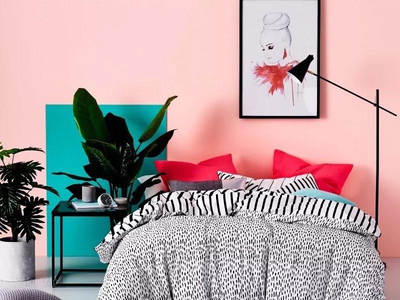


Designers who don't use good colors are not good cooks!